
The Port of Walla Walla realizes that all businesses are struggling with the current COVID-19 health and the economic crisis that is upon us
We are continuing to receive and review the various financial support packages that may be available for assistance for our Walla Walla County businesses, including the Port tenants located within the Airport District. As one of the functions that the Port of Walla Walla is responsible for is serving as the ADO (Associate Development Organization). Through this function, we may be able to be the conduit for state and federal funding, should some come available.
Please continue to keep us apprised of your business status. We want to see all businesses come out of this crisis, but know that some may not be able to endure this complete shutdown of commerce.
We are all in this together and together we will come out of this stronger and better informed.
Stay safe and healthy.
Patrick H. Reay
Executive Director
Port of Walla Walla
310 A. Street
Walla Walla, WA 99362
509-525-3100 Phone
509-525-3101 Fax
pr@portwallawalla.com
Census 2020 Response Rates – Interactive Map
How is your city responding?
Over the last year, this newsletter has featured a few articles on the importance of the decennial census. From a community indicator perspective, data collected during Census 2020 will be the foundation for estimates until 2030. Ultimately the decennial census is the largest data source for Walla Walla Trends, both directly (population, educational attainment, etc.) and indirectly (per capita figures such as gross domestic product, personal income and taxable retail sales).
The Census 2020 Response Rates interactive map shows in real-time Census 2020 response rates for the nation, all 50 states (and Puerto Rico), every Congressional District in the U.S. Further, this interactive includes the Cities of College Place, Prescott, Waitsburg, and Walla Walla, tribal areas, and census tracts. Zoom in on Washington State (or any point on the map) for greater detail.
Households considered self-responders are those receiving their census form through the mail or dropped off by a Census worker. These processes began in time for most households to receive their census forms between March 12th and 20th. The self-response rate includes all unduplicated online, regular mail, and phone responses of an area, while excluding any nonresponse follow-ups. No adjustment is made for vacant homes or undeliverable addresses.
Don’t forget to check Census 2020 Response Rates map in the following weeks and months as the numbers get closer to, but never achieving 100%. The national self-response rate during Census 2010 was 74%, with only twenty cities larger than 100,000 residents self-responding at 80% or higher.
Since all households in the U.S. need to be accounted for, it takes an army of Bureau of Census workers on the ground to follow-up with non-responding households. But Census 2020 hasn't reached the point of knocking on doors yet and are encouraging people to respond "as soon as you receive your invitation" to minimize in-person follow-ups. The official message is this:
"It has never been easier to respond on your own, whether online, over the phone or by mail—all without having to meet a census taker."
Forecasting the COVID-19 Impact on Hospitals
Projecting the next 4-months
By now, everyone knows COVID-19 poses a serious risk to both people and our health care system. One might be “living under a rock” to not know this, but most likely, they’re sheltering in .
Information seems to be changing by the hour and data is changing by the minute, creating what might be the perfect environment for all sorts of projections. While worst-case scenarios are important to predict if not for the simple purpose of preparing the best we can, they are on the outer fringes of predictions, and thus possible, but highly unlikely.
Allowing worst-case scenarios more attention than they deserve creates unnecessary fear-making context nearly as important as data. Data helps us to see through the noise, but it still needs context.
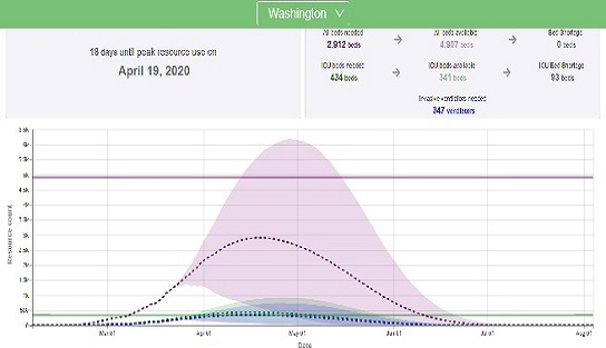
Through a simple, but effective dashboard, the Institute for Health Metrics and Evaluation at the University of Washington (IMHE) provides context with the “first set of estimates of predicted health service utilization and deaths due to COVID-19 by day for the next 4 months” to “determine the extent and timing of deaths and excess demand for hospital services for each state in the U.S.” Specifically, the dashboard was created “to provide hospitals, policy makers, and the public with crucial information about how expected need aligns with existing resources, so that cities and states can best prepare.”
COVID-19 is expected to have peak demand on hospital resources in the U.S., shortages are projected to be 49,292 hospital beds, 14,601 ICU beds and 18,767 invasive ventilators.
Context, however, shows of the projected U.S. shortages, 35,301 hospital beds and 6,949 ICU beds are for New York State alone. So, while yes, everyone is facing the same public health issue. But no, the global or even national projected estimates will be different from place to place within the U.S.
Projected hospital resource peak use for all 50 U.S. States include: Hospital beds as both Needed and Available for both Total and Intensive Care Unit (ICU) beds and the need for invasive ventilators. The caveat is communities must follow social distancing guidelines or the trajectory of these estimates will change for the worse.
Additional information from the IMHE includes dates if/when educational facilities were closed, non-essential services were closed, a stay at home order was issued. A spot is reserved for any orders to severely limit travel.
It’s website presents two more graphs for each state and the U.S. – projected deaths per day and total projected deaths. Using the day with the most recent information, each graph uses confirmed data looking back in time (solid line), yet projections looking ahead (dotted line) with high and low uncertainty levels through the end of the COVID-19 pandemic. The official end of the pandemic will be called when 10 or fewer deaths in a day are recorded.
A key assumption for the projections: people continue to adhere to social distancing and any stay at home orders or travel restrictions (if any are imposed).

Information Is Beautiful - How to Live Long
What really extends lifespan?
What is the key to living a long, healthy life? It depends on who and when you asked. For example, in an era before 1950, occasionally doctors were paid spokesmen for cigarette companies – a great choice since a doctor is obligated through the Hippocratic Oath to only endorse the healthiest brands.
In all fairness, they were unaware then to what is obvious now: tobacco in any form is unhealthy. We know we can greatly reduce the risk of tobacco-related illnesses by choosing not to use tobacco. Imagine going back in time a few decades and trying to convince Dr. Cam L. Marlboro he should quit his side gig as a puffing pitchman.
As if the flu (pick any flavor), Black Plague, Cholera, Ebola, Smallpox, and Zika aren’t enough, now the coronavirus....
I wish someone would just tell me what to do (or not to do) to increase my life expectancy, lifespan, and longevity, and I’d do it (or not)!
What’s that you say, Information Is Beautiful? You know how I can Live Long – and what could really increase my life expectancy, lifespan, and longevity? I’m all ears!
I see some of the things I can do to extend my lifespan are easy, such as having a long-lived maternal grandfather (thanks Grandpa Floyd) and having more pets. Others are debatable, such as getting married and /or being polygamous. The obvious include avoiding cancer and heart disease, while the difficult include being rich and a woman (even though statistically women do live longer, this writer is currently a male).
While COVID-29 is very serious, we thought it would be nice to take a light-hearted approach to this article. Whether working in essential industries or staying at home, we thank everyone who is doing their part.
So, remember to live long, avoid routine work, lower cynical hostilities, and trade your cigarettes for close friends (and check out the Live Long interactive so all this makes better sense).
Walla Walla’s Economy Displaying Stability
Top-5 employing sectors continue growth
by Dr. Patrick Jones
With the unfortunate exception of the novel corona virus, life in Walla Walla generally doesn’t change too fast. Population grows slowly, the local colleges and universities educate the same number of students, wineries keep producing world-class wines, and the mix of jobs remains stable. Walla Walla Trends 1.3.5 displays this stability in graph form.
The indicator measures the shares of jobs in the county taken up by the five largest sectors. As one can observe, the height of the bars hasn’t budged too much, indicating that shares of these top five, accounting for about 70% of the workforce, haven’t grown or shrunk much over time. Due to its much large economy, Washington State’s counterparts to these sectors sum to a lower percentage of the workforce, largely because any large economy will be more diversified than a smaller one.
Within Walla Walla’s top five sectors, the rankings have remained the same from 2003 to 2018, the most recent year for which data are available. Government remains the top sector, with 19.5% of the workforce in 2003 and moving up slightly to 20.3% in 2018. This was nearly four percentage points higher than the state average. Government is “big business” here.
Government jobs are usually dominated by local government counts, which in turn, are driven by public school district employment. This is true here, where 44% of all government jobs in 2018 were with local entities. That share, however, is considerably lower than in most Eastern Washington metros; for example, Spokane’s local government jobs accounted for over 60% of the total.
Why might Walla Walla depart from its regional peers? The answers are pretty obvious: the State penitentiary and the large presence of two federal agencies: the Army Corps of Engineers and the Veterans Administration.
The second largest employment sector consists of Healthcare & Social Assistance. The second part of the sector includes workers in organizations that serve children, families, adults (especially the elderly), and vocational rehabilitation. If there has been a growth sector since in Walla Walla, this is one of the two. In 2018, it accounted for 15.1% of all jobs. Fifteen years prior, its share was about two percentage points lower.
The presence of healthcare & social assistance organizations in the county is larger than in any Eastern Washington metro area except for Spokane. There it stood at 18.5% in 2018, undoubtedly the highest share among all the state’s metro areas.
The third largest sector was and is manufacturing. In 2018, its share of total employment was 14.1%. Walla Walla’s labor concentration in manufacturing is the highest among Eastern Washington metro areas, and for that matter, for all counties in the state except Snohomish. True, the share has slipped from 2003 by one percentage point, but this is the lowest relative drop of manufacturing among all counties except again for Snohomish.
What is behind the outperformance of Walla Walla’s manufacturing sector? Due to data suppression by the source, Washington State Employment Security (ESD), to provide enough confidentiality, it is difficult to track all the industries over time. But ESD data do show increases in the two largest industries: food & beverage as well as machinery manufacturers.
Ranked fourth in 2018 was agriculture, at 13.4% of the county’s workforce. Like healthcare & social assistance, agriculture has gained in importance over the past 15 years, its share picking up nearly two percentage points. Nationally, agriculture’s share of the labor force has fallen over the same period. Not here.
Last among the top five sectors in Walla Walla was retailing, at 8.4% of the workforce. Its share has declined slightly over the past decade and half. Unlike the other top sectors, its total workforce has shrunk here, although general merchandise (big box) store employment has run counter to the decline.
Just missing an appearance in the top five sectors is the hospitality sector. This consists of eating and drinking establishments, and to a lesser extent, all forms of accommodations providers. Hospitality, not surprisingly, has grown relatively rapidly over the past 15 years, picking up one-third more workers. In 2018, it claimed 2,000 on the total payroll. Given the very slow employment growth in the retail sector, Walla Walla hospitality will likely land in the top five within three years.
Why should we care about the relative importance of these sectors in the economy, beyond any general interest in knowing how Walla Walla’s structure is different from its Washington neighbors? Because the sectors compensate its workers at different levels, leading to a much different ranking in terms of wages paid. If the indicator of the top five sectors were re-cast by wages, the mix would be the same, but the shares would be much different. By this measure, the largest sectors by employment grow even more important: government claims 25%, manufacturing 18%, and healthcare & social assistance 17%. In contrast, agriculture shrinks to 9% and retail to 5%.
If a major goal of economic development efforts is to raise total income in the county, one would point the recruitment compass to the first three sectors. Easier said than done, of course, and some might not agree that expanding government jobs is a strategy to pursue. Or, perhaps one could aim the compass at those higher paying sectors that don’t appear in the top five list, whether by head count or total wages. These are, ranked by average annual wage: scientific & professional services, finance and insurance, and information. At the moment, however, these sectors are quite small in Walla Walla. It would take many new jobs to vault them into the top five by total wages paid.
For the foreseeable future, it seems to this observer that Walla Walla’s economy will be based on a mix of jobs not unlike the past few years. The trends are likely to stay in place: faster than average growth in the healthcare and the hospitality sectors, leading to rising shares. For the other large sectors, the status seems likely to prevail.
Rental Affordability Lower Than Benchmarks
Little change in number and share of renters
by Scott Richter and Dr. Patrick Jones
There are many factors when considering the age-old question of whether “to rent or to buy” a home. Some questions, such as financial stability, are standard. Others are more personal such as wanting mobility or not wanting the risk or responsibility of homeownership.
When this question is asked also has a large affect the answer. Consider how people might respond to the “rent or buy” question just after the housing bubble burst compared to the last few years when most places across the U.S. were well into recovery with pent-up demand for additional housing, for both rental units and homes listed for sale on the market. This helped drive prices up and affordability down.
To be considered affordable, shelter costs, including utilities and household fuels, should take up no more than 30% of total household income.
Looking at Trend 5.1.9 Renting Households Paying 30%+ of Income on Shelter Costs, there has been very little change in this series.
The estimated share of renters during 2018 in the Walla Walla Metropolitan Statistical Area (MSA), which is Walla Walla and Columbia Counties combined, who were spending 30% or more on shelter costs was 50.2%. This is higher than both the state and U.S. benchmarks of 45.3% and 46.2% respectively.
It was higher than a few of our neighbors too. The share of renting households spending 30%+ of their income on shelter costs during 2018 in Benton and Franklin Counties combined was 41.6%, nearly 10 percentage points lower than the Walla Walla MSA. Chelan and Douglas Counties combined share of renting households was 33.5%, and Yakima County was 40.6%.
What do rents look like in Walla Walla County (just the county, not the MSA). Unlike other counties, there is no semi-annual summary from the University of Washington’s Real Estate Research Center. So, consider findings of the U.S. Department of Housing & Urban Development on current fair market rent on Trend 5.1.10 Monthly Fair Market Rent (FMR). FMR includes rent, plus the cost of all tenant-paid utilities, with the exception of telephones, television, and internet services.
During fiscal year 2019, FMR for one-bedroom apartments in:
- Walla Walla County was $735, and $972 for two-bedrooms.
- Benton County was $778, and $962 for two-bedrooms.
- Yakima County was $637, and $837 for two-bedrooms.
Another indicator on Walla Walla Trends calculates this into the annual income needed to afford FMR.
Hearing all the time how home ownership is the most common way for an average U.S. family to gain net worth over their lifetime, we’ll see if the new coronavirus-altered world we live in keeps this tradition alive. Or if we’ll look back in this indicator and see 2020 as a pivot point for dramatic changes the housing market, which could impact the shares of renters and homeowners.
Further, a prominent aspect of renting is no commitment allowing people to walk away from their current housing situation with very little personal loss. Along with strength in long-term homeownership is the potential for shorter-term unstable housing markets, perhaps as an impact of the COVID-19 pandemic. We will have to wait and see.
Net Firms Created Show Negative Growth Last 4-Years
Crop production and large scale farming
by Brian Kennedy and Dr. Patrick Jones
With the shuttering of the downtown Macy’s residents might be starting to ask, what is happening to the businesses within the community? Are other firms starting to feel the pressures as well? Fortunately, the Washington Employment Security Department tracks the total number of firms within a county in their Quarterly Census of Employment and Wages (QCEW) dataset; unfortunately, this doesn’t paint the best picture for Walla Walla County.
Trend 1.2.5 tracks the net firms create defined as annual difference between the number of firms. In the sixteen years within the trend, Walla Walla County has posted eight years of expansion and eight years of contraction in the number of firms added. However, five of those eight years of contraction have all happened in the most recent five years. The last five years have resulted in a loss of 332 firms and had an average growth rate of -2.9%. In fact, any gains made throughout the trend have all been recently offset. There were 113 fewer firms in 2018 than 2003. As the graph shows, local conditions tend to mimic the trend of the state rate up until the 2016, when Washington’s growth rate started to show positive growth again. Although Walla Walla County’s rate has been improving slightly, it is still in the red.
While Walla Walla County’s trend is a bit more volatile to the state, their phenomenon isn’t unique. Other Eastern Washington communities face similar conditions. The net firms measure in Grant County has contracted in three of the last five years, dropping by 259 firms while posting an average growth rate of -1.5%. The number of net firms in Yakima County has contracted four out of the five years, dropping by 1,516 firms for a -3.4% average growth rate. Chelan and Douglas Counties have fared slightly better, contracting by just 100 firms and posting an average growth rate of just -0.4% over the last five years.
Contributing in part to the volatility of firms entering and leaving the market is the fact that Walla Walla has quite a number of very small businesses, those firms with less than ten employees. The Small Business Administration states that only about two-thirds of businesses survive at least two years and only about half survive at least five years.
Displayed on Trend 1.2.6, Walla Walla County’s share of very small businesses is consistently higher than the state’s share by about three to five percentage points, averaging about 83% across the trend. However, following a similar trend as the overall net firms indicator, the recent decline in the share of very small businesses shows that these businesses have been closing up shop at a rate much faster than those of average businesses. From 2003 through 2014, the share of small businesses showed slow, steady growth, accounting for 83.7% of all firms in 2003 and increasing to a trend high of 86% in 2014. Beginning with 2015, however, the trend switched directions and the share of very small businesses began to decline, both locally and statewide. Walla Walla County’s share of small businesses has now dropped about eight percentage points, with the state share dropping by about six.
Examining the data at the industry level shows that the sector that has been contracting the most is agriculture, specifically crop production. Of the 113 fewer firms in 2018 compared to 2003, 74 of those firms came from crop production, accounting for about two-thirds of all the lost firms. Additionally, data taken from the QCEW shows that the average employees per firm in crop production has increased from 10.4 in 2003 to 20 in 2018. Given the reduction in small businesses and a majority of those firms crop production would support the notion that the crop production is increasingly concentrated in larger-scaled agribusinesses.
So, if the number of firms are closing and small businesses are making up a smaller portion of all firms, what are the positive notes? Well, employment has still been expanding, shown on Trend 1.3.2. The total number of employed has expanded by about 2,000 employees over the past five years, at a rate of about 1%, outpacing population growth. So, despite the falling number of firms, more people are still being able to enter the labor market.
Additionally, the median household income has continued to increase as well, growing at a compound annual growth rate of 5.3% since 2013, outperforming the United States (2.9%) and Washington State (4%). Contributing to this income growth lies in part with the industries within the community where more firms have been added. Manufacturing, with an average annual wage of $57,910, and healthcare and social services, with an average annual wage of $49,005, report the largest growth in firms from 2003 to 2018, as shown on Trend 1.1.5. Both these sectors have wages that are higher than overall average wage by about $13,000 and $4,000 respectively.
Only time will tell whether the community will benefit from the contraction of small firms in crop production, but it is clear that the growth in employment and wages is moving in the right direction.
Students Enrolled in Community College for Workforce Training
As unemployment ebbs, enrollment flows
by Scott Richter and Dr. Patrick Jones
Arguably, almost everyone enrolled in higher education is receiving workforce training. While this perspective is technically true, workforce training in the language of higher education refers to student intent. Specifically, workforce training refers to students enrolled in programs where a degree or certificate can be completed in 2-years or less.
According to the National Student Clearinghouse Research Center Fall 2019 Current Term Enrollment Estimates, when all institutional sectors are combined, annual enrollment has declined every year from the fall term of 2015 through the fall term of 2019. As individual institutional sectors, they didn’t fare much .
Overall, decreased enrollment for workforce training at Walla Walla Community College is currently following the trend of decreasing college enrollment across the .
Digging into the Fall 2019 Current Term Enrollment Estimates report, a recent National Public Radio (NPR) report summarized the top-3 reasons why enrollment in college has decreased by 2.3 million, or by 11% from 2011 to 2019. They are:
1) A strong economy. As a result of the Great Recession, college enrollment increased, with many schools setting enrollment records. Recent decreases are more reflective of where we should be had the Great Recession not occurred.
2) Our shifting demographics. The decreasing U.S. birth rate and the number of people graduating from high school are flat trends; furthermore, fewer students are going straight into college from high school.
3) Increasing cost of higher education. In addition to growing tuition, states have been decreasing financial contributions, so students are responsible for paying a larger share of the increasing tuition.
Looking at Enrollment at Walla Walla Community College for the Purpose of Workforce Training on Walla Walla Trends, we can observe that enrollment for this purpose peaked during the 2009-2010 school year with 2,942 students. By the 2017-2018 school year, enrollment for workforce training dropped to 2,083 enrolled, decreasing by 29.2%.
While offering programs perhaps more traditionally thought of as workforce training such as carpentry, diesel mechanics, and welding, workforce training also includes courses and degrees/certificates in accounting, business, computer science, and engineering. The difference ultimately is the intent of the student – whether they are transferring to a university to continue towards earning a bachelor’s degree, or to (re)enter the workforce.
Workforce Training programs offered at Walla Walla Community College, along with the degree and / or certificate graduates of each program earn can be found here.
As a rate of 1,000 residents ages 18-64, this measure captures the Walla Walla Community College District, which includes the following counties: Asotin, Columbia, Garfield, and Walla Walla. Click here to view a map, which also shows WWC satellite campus locations.
Despite the decline in enrollment, Walla Walla Community College has still shown a much higher penetration in the population for this education track. Its rate has run approximately 2-3 times greater than the state benchmark. the smallest difference, 25.5 per 1,000, occurred during 2017-2018, the most recent school year data is available. The largest difference, 34.7 to the state average, occurred during the 2009-10 school year, which coincides with the highest year in the series for estimated total enrolled in workforce training Walla Walla Community College.
The Walla Walla data seems to bear out one of the NPR’s hypotheses: the effect of a strong economy (or absence thereof). The 2009-10 school year experienced the highest number of students enrolled for the purpose of workforce training, 2,942, in the series. 2010 also displayed the highest annual average unemployment rate (8.0%) found in the series shown in Trend 1.3.2 Total Number of Employed Persons & Unemployment Rate. The high unemployment rate continued into 2011 , the second-highest year for enrollment for workforce training at the community college.
As with many activities reliant on how local, state, and national economies bounce back from the COVID-19, enrollment in higher education will be affected. Chances are the longer it takes unemployment figures to return to their pre-COVID-19 levels, the greater the boost to community college enrollment numbers will likely get.